Tuesday, 4 October 2011
Thursday, 2 June 2011
Island Development Road And Cross Roads
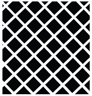
Before Placing all the buildings onto Unity I thought It would be adviced to get the road and traffic Lights into place, This was the wasy part, The Road was very simple to create, the crossroads section was a little bit more tricky as I needed to make sure that none of the cubes, in this case which I used for road overlapped as that can cause a minor problem when importing onto maya which I found out, I didnt use much research for the road section of the project as that was pretty much straight forward, heres the simple texture I used which was very easy to create, Only slight challenge I had was making it stretch enought to fit the road and making it stop both at the end and at the crossroad, what was more challenging was placing the crossroad texture into the middle as I had to use insert edge tool inwhich to get the markings accurate. Here are the two simple textures which I used, I created them in illustator.

From that point I wanted to create some trafic lights at the end of the road, which would be the point in which on the game when your playing you cant go futher,on that point I want everything to be blocked off, the idea is there are 3 bridges, the west bridge, north bridge and east bridge. However all acsess from and out of the island are blocked off And at the crossroads section idea to have a few cones scattered about and signs saying bridge is out, all acsess is postponed, that kind of feeling, as far as the storyline goes im not sure as I'm going to mentione why, as that could be something which keeps the player intrigued to find out and carry on playing the game.
Just wanted to have a look at some crossroads in New York to gain some influence as for the shape of the lights and so on.
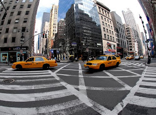
Heres the above picture I found however its not the best but I can draw some reference from them. However Im wanting to create a simpler form, As far as colouring goes, Im not gonna create a texture and just have them black and white with the flashing red, which Actually looks really effective, Obviously I want the symbolise danger and that the city is in chaos. Id actually really like to animate them as to having them flashing but Im not sure as to how to do that at this time but if I have time towards the end Id really like to go back andexperiement with that idea.
Looking into road signs and Cones, I have to be very careful here as obviously I dont want to mistake British and American signs. Heres a very good image of which I can take influence by, just a simple design and my idea is to texture it with red stripes to fit in with the theme which could work well, also Maybe include a bridge out / road closed sign but I dont think it would need it, and with the choice of colours used it would stand out as something important on the island.
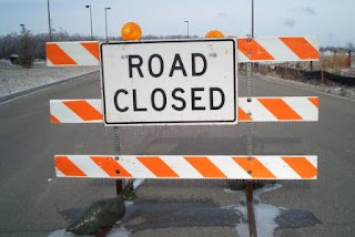
Heres The two simple textures inwhich I used to create The Signs and The Cones.


As you can see from the screenshot of how things are looking on unity I really like the area of the game, although its not a main part of the level, it provides some infomation to the users for the storyline and the colours work really well especially the cones placed on the road it looks really effective next to the black and white road. Just to add i'm planning on leaving the roads as they are, I dont think theres any need to build a broken bridge for example, as I belive you are given enought infomation for the audience to imagine there is a bridge there as it helps with the timeload.


From that point I wanted to create some trafic lights at the end of the road, which would be the point in which on the game when your playing you cant go futher,on that point I want everything to be blocked off, the idea is there are 3 bridges, the west bridge, north bridge and east bridge. However all acsess from and out of the island are blocked off And at the crossroads section idea to have a few cones scattered about and signs saying bridge is out, all acsess is postponed, that kind of feeling, as far as the storyline goes im not sure as I'm going to mentione why, as that could be something which keeps the player intrigued to find out and carry on playing the game.
Just wanted to have a look at some crossroads in New York to gain some influence as for the shape of the lights and so on.

Heres the above picture I found however its not the best but I can draw some reference from them. However Im wanting to create a simpler form, As far as colouring goes, Im not gonna create a texture and just have them black and white with the flashing red, which Actually looks really effective, Obviously I want the symbolise danger and that the city is in chaos. Id actually really like to animate them as to having them flashing but Im not sure as to how to do that at this time but if I have time towards the end Id really like to go back andexperiement with that idea.
Looking into road signs and Cones, I have to be very careful here as obviously I dont want to mistake British and American signs. Heres a very good image of which I can take influence by, just a simple design and my idea is to texture it with red stripes to fit in with the theme which could work well, also Maybe include a bridge out / road closed sign but I dont think it would need it, and with the choice of colours used it would stand out as something important on the island.

Heres The two simple textures inwhich I used to create The Signs and The Cones.


As you can see from the screenshot of how things are looking on unity I really like the area of the game, although its not a main part of the level, it provides some infomation to the users for the storyline and the colours work really well especially the cones placed on the road it looks really effective next to the black and white road. Just to add i'm planning on leaving the roads as they are, I dont think theres any need to build a broken bridge for example, as I belive you are given enought infomation for the audience to imagine there is a bridge there as it helps with the timeload.
Unity Games
I just wanted to take a step back from my project work and Have a look at some games which have been developed on Unity to give me an idea of what is acheivable and incluence maybe on certain aspects such as sound, how the game plays and Visual influences.
I found this game called Paper Moon very interesting which I founf on Unity, visually it has a similar style as it has that black and white feel we've both gone for and I really like that kind of cartoony cut out effect which works really well.
I had a further look around at some of the games but honestly I can only say that this was the only game which really apeared to me as a point of similar games inwhich to gather research from however I was really impressed with the game and especially the cut out graphics.
More Reseach On Buildings.
As I was developing on with my project I wanted to gather some ideas inwhich to texture my Buildings and gather influence from work who have used a similar stlyle im heading towards. First thing that came into my mind was The music video from Parkway Drive - Sleepwalker which I have mentioned before on a early project but its a perfect focal point of research. Heres the video below.
Watch the video from 2.08 onwards and That is a perfect example of the kind of style im Heading towards, That contrasting element between the black and white looks really good, I think there probably a little too bit realism for my project as in everythings perfect, such as the shade and the lines. Im wanting mine too be a little more cartoonish / graphic. I really like the way in some buildings main focus point of colour is white and others black as they've got it to resemble the reflection from the sunlight very well, which is something which could be very challenging on unity but its something to experiment with which could be something to look at to make it more interesting indeed, So heres a perfect sense of research.
Obviously theres Sin City which Ive already mentioned alot, which I wont go into too much detail, but from the way things are looking im heading down a much lighter / cartoony version of sin city however Im still looking on a similar atmosphere and that crime / guns / sex apeal.
I was sat watching Eurovision the other saturday for a laughth, however Im glad I did as I found the perfect example of research coming from the most unlikeliest of places in the Estonian Pyro as you can see below.
This is absolutly perfect in the style aproach I can head towards, Obviously I dont want to copy this technique but I want to design my own building incorporating a very similar style, What really grabbed me was the way in which the windows for example are oversized emphasising that cartoonish / graphic novel aproach. And the way it has that handrawn aproach with lines off and windows tilted slighly towards the side however it adds to the effect and work brilliantly. Something I also want to mention is that building to the left, where it has the shape however the building line goes complely off with looks really cool and is something I could experiement with myself.
On a Little side note over that same Weekend I watched War Of The Worlds The Remake,which is set in New York aswell and I just wanted to comment on the trailor, the way in which the Highway completly dominates the housing, just thinking that could be an area I could develop into my game environment, maybe having the trainline look superior to some of the buildings, adding to that everything is superior that you atmosphere im heading towards.
Development On The Island
First off everything imported onto Unity from Maya sucsessfully, the only issue I had was getting the scale right as at this time All I had was a bowl, and I havent designed the buildings and inerior so obviously I wasnt sure as to how big the bowl was going to be, but from early tests I dont want the bowl to be too big as I noticed the way it lost detail and in some casses it was even hard to notice the outline so judging the scale is going to be important but first I need to develop the buildings and the surroundings. I did a few quick tests, basically with some cubes on maya and used some really simple textures. Heres the texture I used for one of the test. I wanted to get a feel for how my style would look on unity. I based this quick texture on an image of a backstreet house in New York.
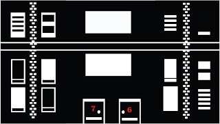
Firstly the results were really good and I was happy with the way the texture came out. It looked very graphic novel influenced, which im happy about as thats the style im going for, that sin City feel. However There was something I wasnt too keen with and that was not the building or texture. I was starting to have second thoughts on the Skyline colours which at this time were red and black, mainly due to the fact that like sin city the black and white are the main contrasting colours which are used, And my plans are to emphasise certain aspects of the environment such as Blood, Guns and so on with the colour red, However with the skyline been red whilst it looks good and very sunset like, I feel I may loose that effect. also with the way I have designed, Id have to keep the water and land potentially red or else it could look very messy, however it might not, but overall I think its the right choice to make. Its not a hard job to fix, its just going on illustator and chanding the colours, my idea now was to have the sky white and the buildings black with the windows white, that effect Ive mentioned earlier, However what I belief will look good now is to have the sun red to contrast well and stand out. Heres my results below.

I actually prefer this look, and when put onto unity it looks really effective and works well, however I beliefe Im in a change of direction as the syline dosent work as well with the black textures on the buildings as I would have Liked so I'm going to look into experimenting with the colour white for the buildings.

Firstly the results were really good and I was happy with the way the texture came out. It looked very graphic novel influenced, which im happy about as thats the style im going for, that sin City feel. However There was something I wasnt too keen with and that was not the building or texture. I was starting to have second thoughts on the Skyline colours which at this time were red and black, mainly due to the fact that like sin city the black and white are the main contrasting colours which are used, And my plans are to emphasise certain aspects of the environment such as Blood, Guns and so on with the colour red, However with the skyline been red whilst it looks good and very sunset like, I feel I may loose that effect. also with the way I have designed, Id have to keep the water and land potentially red or else it could look very messy, however it might not, but overall I think its the right choice to make. Its not a hard job to fix, its just going on illustator and chanding the colours, my idea now was to have the sky white and the buildings black with the windows white, that effect Ive mentioned earlier, However what I belief will look good now is to have the sun red to contrast well and stand out. Heres my results below.

I actually prefer this look, and when put onto unity it looks really effective and works well, however I beliefe Im in a change of direction as the syline dosent work as well with the black textures on the buildings as I would have Liked so I'm going to look into experimenting with the colour white for the buildings.
Missing Interim Crit
Unfortunatly due to circumstances involving the brainless parrots at Unipol I had to miss the interim crti as they thought it would be a good idea to lock my door for some unknown reason on the Bank Holiday, so I had to wait around 5 Hours for someone to come around to let us in however he had to break the lock. Therefore I had to wait on tuesday which was the day of interim crit for someone from unipol to come and sort out locks, Even though I didnt get to show my presentation and gain advice I was happy with how my project was coming along and thought of some intersting ideas in which to carry the project forward.
The Final Skyline
Heres My Final Skyline and im deeply happy with the outcome. It looks really good and even better when its connected together in a circular plane and looks like a full city, Ive also been experimenting with getting the Shadow effect right which Im doing on Maya,I have decided to create a the whole shape in maya which is going to be like a bowl shaped, Obviously the sides are going to be the skyline and the bottom edge will be the reflection similar to the screenshot I posted a couple of blogs back however this time it will be in a circular shape both the skyline and reflection, And the empty sapce shall be used for the water and the city. This also allows me not to use the terrain bottom which I see as a benifit, and hopefully my plans will work well for some great results.


Subscribe to:
Comments (Atom)

