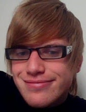
This is an image from 100 bullets which struck me on first read and thought of it as a great way to start my development work on. basically my idea was to start of the title sequence with an image of the main character which in this case is the guy whose role in the novel is to provide characters with a brief case with 100 untraceable bullets with the option of getting revenge and I really liked the image as it engages with the audience well and believe there is potential work which could be included in After effects such as animating the eye, and ultimately believe it will work well as an opening shot. then my idea at this current stage is to have a shot of the briefcase included after. The idea is to take this image and experiment with it using different styles and taking influence from research already gathered however not to copy into it too much.

Heres where I just traced around the image and scanned it then printed a few versions which I plan to experiment with. I came up with this result based on what I created shortly after which you can identify as the opening shot on my soryboard. Heres what I designed

To create this image I fist kind of went over the image in chalk as I thought it would be an interesting souce of media to use and to experiement with and would create a bold striking colour, so I went over the outline and then shaded in some of the areas to create a more mystic feel to the character which Im planned on doing, I then cut out some card hugely influenced by saul bass work and stuck it on, purposly not neat as that was the effect im really looking and I believe that element worked really well and finally I just got a knife and scraped the red chalk to create a kind of blood splatter effect which didnt work aswell as It wasnt the bold effect im going for which I shall experiment with later to hopefully find a better outcome in which to use as blood.Im also not keen on the image of the boss as the qualitly is not as good as I had hoped I think the best step forward from here is to use illustator to create a better effect. The overal shot is slightly different to what I have on my storyboard as I quite like the open breiefcase without the gun as i Had an idea to write some titles in their which could work well.

From what I was previously talking about heres a quick mockup of my potential idea
of having the text included within the briefcase, Obviously this was a quick mockup so the font, size as positioning is far from final however I do quite like the font as it provides a hand drawn effect which i am looking for as it links directly towards graphic novels, really like the design but shall now create a quick mockup of having a gun included within.

Heres a quick gun I designed based on a image of a gun which I plan to include within the 1st shot. I found Google images which I made into a design which I like and fits into the graphical aproach I am heading with my title sequence.

Further more development work included more aspects, im not too keen on the gun been placed inside the briefcase, I think a potential idea for future development whoch was reccomended to me was to have the briefcase open to what would be a gun and 100 bullets inside which potentially is a really good idea which I will consider, however I think the main focus is to get The man right, through using illustrator and photoshop as scanning in gets rid of alot of the detail and it would be a easier process into getting more effecient colours.

Heres what I come up with using photoshop and using the paint brush tool and I an definatly see the improvement and I really like image as its more to the style im looking for, and to the left is a kind of test in which I plan to include in where his eyes turn red, not sure as to which im going to interect it with as I like a couple of ideas I cam up with as either having them turn red when the text apears or when if I go for the idea of having them iluminate when the breifcase opens which could be a really good effect.

This is the final image Ive settled so far during this side of the development as it provides my with plenty of area to experiment with ideas for example where the text is gonna be plaved. I really like the idea of the lines coming in from different directions to create the gun and then the trigget been pulled abd a blood splatter ecures next to the gun, that could work really well and shall experiment with at a further date.


