Tuesday, 4 October 2011
Thursday, 2 June 2011
Island Development Road And Cross Roads
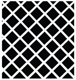
Before Placing all the buildings onto Unity I thought It would be adviced to get the road and traffic Lights into place, This was the wasy part, The Road was very simple to create, the crossroads section was a little bit more tricky as I needed to make sure that none of the cubes, in this case which I used for road overlapped as that can cause a minor problem when importing onto maya which I found out, I didnt use much research for the road section of the project as that was pretty much straight forward, heres the simple texture I used which was very easy to create, Only slight challenge I had was making it stretch enought to fit the road and making it stop both at the end and at the crossroad, what was more challenging was placing the crossroad texture into the middle as I had to use insert edge tool inwhich to get the markings accurate. Here are the two simple textures which I used, I created them in illustator.

From that point I wanted to create some trafic lights at the end of the road, which would be the point in which on the game when your playing you cant go futher,on that point I want everything to be blocked off, the idea is there are 3 bridges, the west bridge, north bridge and east bridge. However all acsess from and out of the island are blocked off And at the crossroads section idea to have a few cones scattered about and signs saying bridge is out, all acsess is postponed, that kind of feeling, as far as the storyline goes im not sure as I'm going to mentione why, as that could be something which keeps the player intrigued to find out and carry on playing the game.
Just wanted to have a look at some crossroads in New York to gain some influence as for the shape of the lights and so on.
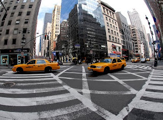
Heres the above picture I found however its not the best but I can draw some reference from them. However Im wanting to create a simpler form, As far as colouring goes, Im not gonna create a texture and just have them black and white with the flashing red, which Actually looks really effective, Obviously I want the symbolise danger and that the city is in chaos. Id actually really like to animate them as to having them flashing but Im not sure as to how to do that at this time but if I have time towards the end Id really like to go back andexperiement with that idea.
Looking into road signs and Cones, I have to be very careful here as obviously I dont want to mistake British and American signs. Heres a very good image of which I can take influence by, just a simple design and my idea is to texture it with red stripes to fit in with the theme which could work well, also Maybe include a bridge out / road closed sign but I dont think it would need it, and with the choice of colours used it would stand out as something important on the island.
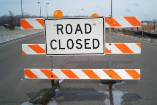
Heres The two simple textures inwhich I used to create The Signs and The Cones.


As you can see from the screenshot of how things are looking on unity I really like the area of the game, although its not a main part of the level, it provides some infomation to the users for the storyline and the colours work really well especially the cones placed on the road it looks really effective next to the black and white road. Just to add i'm planning on leaving the roads as they are, I dont think theres any need to build a broken bridge for example, as I belive you are given enought infomation for the audience to imagine there is a bridge there as it helps with the timeload.


From that point I wanted to create some trafic lights at the end of the road, which would be the point in which on the game when your playing you cant go futher,on that point I want everything to be blocked off, the idea is there are 3 bridges, the west bridge, north bridge and east bridge. However all acsess from and out of the island are blocked off And at the crossroads section idea to have a few cones scattered about and signs saying bridge is out, all acsess is postponed, that kind of feeling, as far as the storyline goes im not sure as I'm going to mentione why, as that could be something which keeps the player intrigued to find out and carry on playing the game.
Just wanted to have a look at some crossroads in New York to gain some influence as for the shape of the lights and so on.

Heres the above picture I found however its not the best but I can draw some reference from them. However Im wanting to create a simpler form, As far as colouring goes, Im not gonna create a texture and just have them black and white with the flashing red, which Actually looks really effective, Obviously I want the symbolise danger and that the city is in chaos. Id actually really like to animate them as to having them flashing but Im not sure as to how to do that at this time but if I have time towards the end Id really like to go back andexperiement with that idea.
Looking into road signs and Cones, I have to be very careful here as obviously I dont want to mistake British and American signs. Heres a very good image of which I can take influence by, just a simple design and my idea is to texture it with red stripes to fit in with the theme which could work well, also Maybe include a bridge out / road closed sign but I dont think it would need it, and with the choice of colours used it would stand out as something important on the island.

Heres The two simple textures inwhich I used to create The Signs and The Cones.


As you can see from the screenshot of how things are looking on unity I really like the area of the game, although its not a main part of the level, it provides some infomation to the users for the storyline and the colours work really well especially the cones placed on the road it looks really effective next to the black and white road. Just to add i'm planning on leaving the roads as they are, I dont think theres any need to build a broken bridge for example, as I belive you are given enought infomation for the audience to imagine there is a bridge there as it helps with the timeload.
Unity Games
I just wanted to take a step back from my project work and Have a look at some games which have been developed on Unity to give me an idea of what is acheivable and incluence maybe on certain aspects such as sound, how the game plays and Visual influences.
I found this game called Paper Moon very interesting which I founf on Unity, visually it has a similar style as it has that black and white feel we've both gone for and I really like that kind of cartoony cut out effect which works really well.
I had a further look around at some of the games but honestly I can only say that this was the only game which really apeared to me as a point of similar games inwhich to gather research from however I was really impressed with the game and especially the cut out graphics.
More Reseach On Buildings.
As I was developing on with my project I wanted to gather some ideas inwhich to texture my Buildings and gather influence from work who have used a similar stlyle im heading towards. First thing that came into my mind was The music video from Parkway Drive - Sleepwalker which I have mentioned before on a early project but its a perfect focal point of research. Heres the video below.
Watch the video from 2.08 onwards and That is a perfect example of the kind of style im Heading towards, That contrasting element between the black and white looks really good, I think there probably a little too bit realism for my project as in everythings perfect, such as the shade and the lines. Im wanting mine too be a little more cartoonish / graphic. I really like the way in some buildings main focus point of colour is white and others black as they've got it to resemble the reflection from the sunlight very well, which is something which could be very challenging on unity but its something to experiment with which could be something to look at to make it more interesting indeed, So heres a perfect sense of research.
Obviously theres Sin City which Ive already mentioned alot, which I wont go into too much detail, but from the way things are looking im heading down a much lighter / cartoony version of sin city however Im still looking on a similar atmosphere and that crime / guns / sex apeal.
I was sat watching Eurovision the other saturday for a laughth, however Im glad I did as I found the perfect example of research coming from the most unlikeliest of places in the Estonian Pyro as you can see below.
This is absolutly perfect in the style aproach I can head towards, Obviously I dont want to copy this technique but I want to design my own building incorporating a very similar style, What really grabbed me was the way in which the windows for example are oversized emphasising that cartoonish / graphic novel aproach. And the way it has that handrawn aproach with lines off and windows tilted slighly towards the side however it adds to the effect and work brilliantly. Something I also want to mention is that building to the left, where it has the shape however the building line goes complely off with looks really cool and is something I could experiement with myself.
On a Little side note over that same Weekend I watched War Of The Worlds The Remake,which is set in New York aswell and I just wanted to comment on the trailor, the way in which the Highway completly dominates the housing, just thinking that could be an area I could develop into my game environment, maybe having the trainline look superior to some of the buildings, adding to that everything is superior that you atmosphere im heading towards.
Development On The Island
First off everything imported onto Unity from Maya sucsessfully, the only issue I had was getting the scale right as at this time All I had was a bowl, and I havent designed the buildings and inerior so obviously I wasnt sure as to how big the bowl was going to be, but from early tests I dont want the bowl to be too big as I noticed the way it lost detail and in some casses it was even hard to notice the outline so judging the scale is going to be important but first I need to develop the buildings and the surroundings. I did a few quick tests, basically with some cubes on maya and used some really simple textures. Heres the texture I used for one of the test. I wanted to get a feel for how my style would look on unity. I based this quick texture on an image of a backstreet house in New York.
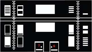
Firstly the results were really good and I was happy with the way the texture came out. It looked very graphic novel influenced, which im happy about as thats the style im going for, that sin City feel. However There was something I wasnt too keen with and that was not the building or texture. I was starting to have second thoughts on the Skyline colours which at this time were red and black, mainly due to the fact that like sin city the black and white are the main contrasting colours which are used, And my plans are to emphasise certain aspects of the environment such as Blood, Guns and so on with the colour red, However with the skyline been red whilst it looks good and very sunset like, I feel I may loose that effect. also with the way I have designed, Id have to keep the water and land potentially red or else it could look very messy, however it might not, but overall I think its the right choice to make. Its not a hard job to fix, its just going on illustator and chanding the colours, my idea now was to have the sky white and the buildings black with the windows white, that effect Ive mentioned earlier, However what I belief will look good now is to have the sun red to contrast well and stand out. Heres my results below.

I actually prefer this look, and when put onto unity it looks really effective and works well, however I beliefe Im in a change of direction as the syline dosent work as well with the black textures on the buildings as I would have Liked so I'm going to look into experimenting with the colour white for the buildings.

Firstly the results were really good and I was happy with the way the texture came out. It looked very graphic novel influenced, which im happy about as thats the style im going for, that sin City feel. However There was something I wasnt too keen with and that was not the building or texture. I was starting to have second thoughts on the Skyline colours which at this time were red and black, mainly due to the fact that like sin city the black and white are the main contrasting colours which are used, And my plans are to emphasise certain aspects of the environment such as Blood, Guns and so on with the colour red, However with the skyline been red whilst it looks good and very sunset like, I feel I may loose that effect. also with the way I have designed, Id have to keep the water and land potentially red or else it could look very messy, however it might not, but overall I think its the right choice to make. Its not a hard job to fix, its just going on illustator and chanding the colours, my idea now was to have the sky white and the buildings black with the windows white, that effect Ive mentioned earlier, However what I belief will look good now is to have the sun red to contrast well and stand out. Heres my results below.

I actually prefer this look, and when put onto unity it looks really effective and works well, however I beliefe Im in a change of direction as the syline dosent work as well with the black textures on the buildings as I would have Liked so I'm going to look into experimenting with the colour white for the buildings.
Missing Interim Crit
Unfortunatly due to circumstances involving the brainless parrots at Unipol I had to miss the interim crti as they thought it would be a good idea to lock my door for some unknown reason on the Bank Holiday, so I had to wait around 5 Hours for someone to come around to let us in however he had to break the lock. Therefore I had to wait on tuesday which was the day of interim crit for someone from unipol to come and sort out locks, Even though I didnt get to show my presentation and gain advice I was happy with how my project was coming along and thought of some intersting ideas in which to carry the project forward.
The Final Skyline
Heres My Final Skyline and im deeply happy with the outcome. It looks really good and even better when its connected together in a circular plane and looks like a full city, Ive also been experimenting with getting the Shadow effect right which Im doing on Maya,I have decided to create a the whole shape in maya which is going to be like a bowl shaped, Obviously the sides are going to be the skyline and the bottom edge will be the reflection similar to the screenshot I posted a couple of blogs back however this time it will be in a circular shape both the skyline and reflection, And the empty sapce shall be used for the water and the city. This also allows me not to use the terrain bottom which I see as a benifit, and hopefully my plans will work well for some great results.


Other Idea For The Background
I have The City landscape, The Bridge however I was looking for something more to place onto the skyline texture. Firstly to make the background that little more apealing and interesting and less repetitive And also to give an incresead scale of the city. I was'nt sure at all what to include within the texture. I was trying to think of some eyecatching massive structures or landmarks which are iconically popular globally. First I thought about the Las Vegas Stratosphere Tower mainly for the fact is one of the most tallest buildings in the planet, and the thought it has an a little amusement park on the top of the tower as you can see below. This was the perfect idea of research as from looking at this tower and the amusement park. I thought about the idea of maybe including a few rides in the background, as its completly different to what I already have included within and could work well as who dosent like a theme / amusement park plus there hugely popular in USA.


I thought about a fer rides, however I decided that what could look good and dominate the skyline would be a rollercoaster and a Ferris Wheel, both are hugely iconic and represent theme parks really well, And I believe would stand out brilliantly upon the skyline. I first off started designing A Ferris Wheel. I took huge influence from some of the biggest ferris wheels in the world. I really liked the style and location of the ferris wheel shown below, what with it located next to a river / water. I could represent with it well to my project. I also found this very intering poster on different types of gondolas which I could easily take influence by.


I started of with the idea of including a rollercoaster, I thought about taking influence from the tallest ride in the world which is Kingda Ka at Six Flags Great Adventure, As I believe that would really dominate the skyline, However when it came to illustating it It just didnt look right and looked messy what with it been basically a thin track and loads of lines as support,I couldnt get the feel i was looking for, I just wasnt happy with the results.

So I changed my Idea to the biggest drop tower In The world, which I am visited and It Dominates the skyline for miles, It is called Hurakan Condor, and is located at Port Adventura In Spain, and after taking influence from this type of ride id definatly looked better been situated next to the ferris wheel and they complemented eachother well.

However after playing around with different types of supports, I settled on going for a more tradition style of drop tower, which worked well as I designed it to be alot of square shapes placed on top of eachother which was a simplified version however still looks great, heres an example at the kind of support I was looking at.

Heres the final result as you can see below, Im really happy with the outcome. I Included the bridge to go cross over the Amusment park, to emphasis that aspect of scale and to connect the city to the other side of the city to give that sense of you feeling enclosed within.


I thought about a fer rides, however I decided that what could look good and dominate the skyline would be a rollercoaster and a Ferris Wheel, both are hugely iconic and represent theme parks really well, And I believe would stand out brilliantly upon the skyline. I first off started designing A Ferris Wheel. I took huge influence from some of the biggest ferris wheels in the world. I really liked the style and location of the ferris wheel shown below, what with it located next to a river / water. I could represent with it well to my project. I also found this very intering poster on different types of gondolas which I could easily take influence by.


I started of with the idea of including a rollercoaster, I thought about taking influence from the tallest ride in the world which is Kingda Ka at Six Flags Great Adventure, As I believe that would really dominate the skyline, However when it came to illustating it It just didnt look right and looked messy what with it been basically a thin track and loads of lines as support,I couldnt get the feel i was looking for, I just wasnt happy with the results.

So I changed my Idea to the biggest drop tower In The world, which I am visited and It Dominates the skyline for miles, It is called Hurakan Condor, and is located at Port Adventura In Spain, and after taking influence from this type of ride id definatly looked better been situated next to the ferris wheel and they complemented eachother well.

However after playing around with different types of supports, I settled on going for a more tradition style of drop tower, which worked well as I designed it to be alot of square shapes placed on top of eachother which was a simplified version however still looks great, heres an example at the kind of support I was looking at.

Heres the final result as you can see below, Im really happy with the outcome. I Included the bridge to go cross over the Amusment park, to emphasis that aspect of scale and to connect the city to the other side of the city to give that sense of you feeling enclosed within.

Wednesday, 1 June 2011
Looking At Bridges
As mentioned previously I thought it would very apropiate inwhich to take some time to look at some bridges inwhich to develop into my skyline, obviously the two main bridges which at this moment I'm thinking about the Broklyn Bridge In New York and The Golden Gate which is located in California.


As you can tell from both of these iconic bridges you can tell that they both have very similar structures and are constructed by very simple shapes such as squares and triangles which would be easy to construct on maya if I continue with my idea of having the track come out of the background. I belive it should look good and sticking to that america / new york theme I'm heading towards.
Heres the final result I came up with, It's really simple but looks effective and represents the bridges I researched well and I believe will look good as your viewing up from the first person camera

Id also like to mention I plan on having the bridges overlap within two sections to emphasise the size of the building.


As you can tell from both of these iconic bridges you can tell that they both have very similar structures and are constructed by very simple shapes such as squares and triangles which would be easy to construct on maya if I continue with my idea of having the track come out of the background. I belive it should look good and sticking to that america / new york theme I'm heading towards.
Heres the final result I came up with, It's really simple but looks effective and represents the bridges I researched well and I believe will look good as your viewing up from the first person camera

Id also like to mention I plan on having the bridges overlap within two sections to emphasise the size of the building.
Concept Art Skyline and Development
Firstly I was adviced, inwhich for the mass sheer of my project inwhich to add a skyline to add that extra depth to my city, and would save some construction time within my project. So I went about creating a Syline, My plan was that from where you play the level you can see all the skyline in a 360 view and the idea was that you was surrounded by water and to show the reflction on the skyline on the water. So I decided to progress and experiemnt. First off I had to come up with some concept art. I decided that it would be easier instead of drawing it on paper to just get stuck into illustrator and Photoshop to come up with an ideal design im happy with.

Above was my first attempt of creating a skyline, I was fairly happy with the final outcome however there was something about it that wasnt right. I think I drew the windows and detail too small therefore when I placed it onto a plain it was too stretched, also I recently thought of the idea of including an illustrated sun instead of importing a default from unity which would add to the illustrated and vector feel I was going for. I wasnt sure at this time of the colours to use, thats
somthing to experiment with.


This is my second attempt I did. I slightly made it bigger and I reallly like it. I believe the colours work really well together, and give that sense of a sunset, which is the time of day im aiming towards at the moment as think it would great as you look over the city to the sunset and the tone of the colours add to that depth. I also dont think there was much wrong with my first attempt I just think it needed a background maybe and a sun. Im now planning to import these assets onto unity as im not sure how im gonna make my idea work, So Im gonna experiemnt.
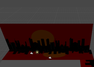
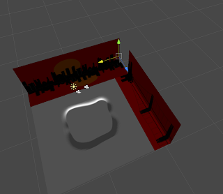
For this experiment I went into Unity and created first an Island in the middle using the terrain tool, then I created two plains in the background and uploaded my texture onto unity and placed it on. I then decided to place another plane undeneath that to create a kind of reflection, which I'm really happy with the results, However as you can tell my method is'nt doing to work as the straight plains overlap eachother at the corner, resulting in it looking really messy. Also I noticed when I went into Play mode it struggled to view the textures, Im not sure as to why but I was reccomended it was because they were too far away from the first person character. I was trying to create a more circular shape in unity inwhich to place my texture on and have it surround the island. However there was no suitable shape inwhich to use on Unity, therefore I was reccomended to Create a Pipe Shape on 3D Maya and texture it from there and then import it onto Unity, so I thought that was definatly worth a try.
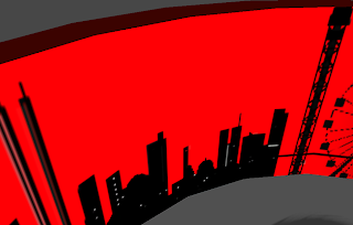
Here are my results from that experiement I just mentioned, And it definaltly was a sucsessfull and provided a great view and skyline around the city, However only complaints was it was a little too repetitive what with the repeated building textures so I thought it would be a good idea inwhich to look into creating a few more textures for the skyline. My first idea what with my story including a form of train was to have some kind of bridge which I thought when coming into modeling I could experiment with the idea of having the bridge feel like its coming out of the skyline texture and into the game environment which could look good. Another note to report was when importing textures onto unity at first it uploaded in not very good quality However I was shown the format into creasting high resolution tetures which looked great on unity, So far I'm really happy with how the project is developing.

Above was my first attempt of creating a skyline, I was fairly happy with the final outcome however there was something about it that wasnt right. I think I drew the windows and detail too small therefore when I placed it onto a plain it was too stretched, also I recently thought of the idea of including an illustrated sun instead of importing a default from unity which would add to the illustrated and vector feel I was going for. I wasnt sure at this time of the colours to use, thats
somthing to experiment with.


This is my second attempt I did. I slightly made it bigger and I reallly like it. I believe the colours work really well together, and give that sense of a sunset, which is the time of day im aiming towards at the moment as think it would great as you look over the city to the sunset and the tone of the colours add to that depth. I also dont think there was much wrong with my first attempt I just think it needed a background maybe and a sun. Im now planning to import these assets onto unity as im not sure how im gonna make my idea work, So Im gonna experiemnt.


For this experiment I went into Unity and created first an Island in the middle using the terrain tool, then I created two plains in the background and uploaded my texture onto unity and placed it on. I then decided to place another plane undeneath that to create a kind of reflection, which I'm really happy with the results, However as you can tell my method is'nt doing to work as the straight plains overlap eachother at the corner, resulting in it looking really messy. Also I noticed when I went into Play mode it struggled to view the textures, Im not sure as to why but I was reccomended it was because they were too far away from the first person character. I was trying to create a more circular shape in unity inwhich to place my texture on and have it surround the island. However there was no suitable shape inwhich to use on Unity, therefore I was reccomended to Create a Pipe Shape on 3D Maya and texture it from there and then import it onto Unity, so I thought that was definatly worth a try.

Here are my results from that experiement I just mentioned, And it definaltly was a sucsessfull and provided a great view and skyline around the city, However only complaints was it was a little too repetitive what with the repeated building textures so I thought it would be a good idea inwhich to look into creating a few more textures for the skyline. My first idea what with my story including a form of train was to have some kind of bridge which I thought when coming into modeling I could experiment with the idea of having the bridge feel like its coming out of the skyline texture and into the game environment which could look good. Another note to report was when importing textures onto unity at first it uploaded in not very good quality However I was shown the format into creasting high resolution tetures which looked great on unity, So far I'm really happy with how the project is developing.
Characters
I decided to come up with some quick ideas on characters, using illustator. First thing is I dont want to spend too much time into developing the characters as thats not the main of my project and at the end of the project if I use them I will only be using them for cutscrenes and for the style Im going for, the silhouette aproach works well for the charcters. I decided there will be 3 members of the gang that are terrorizing the city through crime. Ive took influence from graphic novels in creating these characters, most notably the dude of The Watchmen who wears the mask and wanted a similar personally that chracter has, one of mystery got will also get the job done. I wanted the idea that you will never see there face's, and they al wear similar outfits, demonstarting a tight unity, Of cause dressed in all black as there the bad guys and you represent that with black, and the fact its perfect for stealth and moving around umspotted at night. However the only difference from the outfits is the slight colour and symbol representation as shown below.
Firstly we have The Boss, as with all bosses he is obsessed with one thing, at thats money and more money. He's a character who will put money before friends and family as demonstarting in the story where his plan is to frame you. Of cause I represent him with the dollar sign and the colour green for money.

Secondly we have the Brains of the group, He's the charcter who comes up with all the plans and stradegys for plans. However unlike the other 2 he does ocasionly show signs of guilt and emotion, and is not as effective in combact. I rpresented him with a question mark sign as out of the 3 hes the most mysterious and of cause hes the one the otheres turn to if they need a problem solving.

Finally we have the combat specialist of the group, hes a member whos in your face always wanting to resolve things with violence, He fears nothing and is always the first to enter the fights and normally always wins. I represented him with the exclamation Mark emphasining the impact he has and how dangerous he is. Obviously the use of red is a sign of danger and anger which suits him well.

As for the character in which the player will be using. I dont think im going to show him, if I do it will be in a sililar vein towards the characters above, as he is a hitman, so that kind of suit and tie steriotype however I might go for a white suite to difference himself from above as the story goes he gets framed so it kinds of contast himself from them however we shall see.
Firstly we have The Boss, as with all bosses he is obsessed with one thing, at thats money and more money. He's a character who will put money before friends and family as demonstarting in the story where his plan is to frame you. Of cause I represent him with the dollar sign and the colour green for money.

Secondly we have the Brains of the group, He's the charcter who comes up with all the plans and stradegys for plans. However unlike the other 2 he does ocasionly show signs of guilt and emotion, and is not as effective in combact. I rpresented him with a question mark sign as out of the 3 hes the most mysterious and of cause hes the one the otheres turn to if they need a problem solving.

Finally we have the combat specialist of the group, hes a member whos in your face always wanting to resolve things with violence, He fears nothing and is always the first to enter the fights and normally always wins. I represented him with the exclamation Mark emphasining the impact he has and how dangerous he is. Obviously the use of red is a sign of danger and anger which suits him well.

As for the character in which the player will be using. I dont think im going to show him, if I do it will be in a sililar vein towards the characters above, as he is a hitman, so that kind of suit and tie steriotype however I might go for a white suite to difference himself from above as the story goes he gets framed so it kinds of contast himself from them however we shall see.
Storyline Ideas
Influences To Take
Just wanted to do a quick blog on a few things. Firstly Im not recreating New York or replicating and Buildings, landscape or features. Im just taking huge influence from this location, as it ticks all the aesthetic values im hading towards within my project. I shall be designing all the buildings myself, Of cause they may represent certain features but the idea is to be a city designed by imagining.
Heres a quick reminder of certain things Ive gained influence by and wanting to take into the designing / concept art side of the story.
1. How compact the city is, very narrow streets with tall buildings.
2. The Water which surrounds the city, could be used to great effect with the bridge.
3. The Backstreets have that dark kind of uneasy atmosphere which Im wanting to recreate.
Films and Games Based In New York
Thought it would be interesting to look at a few trailors and In Gameplay footage of some movies and video Games based in New York, just gain some influence of possible directions inwhich to develop the environment, gain more influence about buildings, landmarks and the surrounding area.
First of I Looked at a list of games which have been located / Influenced by the surroundings of New York and The list is huge so there's plenty of references inwhich to gain influence from. From the list I remember playing Max Payne in particular and remember the dark atmosphere especially in some scenes which came within the game, unfortunatly I couldnt find the scene with the Baby Crying inwhich it feels like your walking through darkness as that would have been a great to analyise. However looking at the trailor below you can tell the dark atmosphere, for example within the trailor its all based towards night and set in the back alleys and subways of new york, And the buildings have windows smashed and cardboard against them, something to look into when it comes to texturing the buildings. I aslo really like the cutscrenes used as it tells the story similar to a comic book / graphic novel which is an element Id like to develop. Finally a comment I really like the stroyline involved within this game. The idea of a dark storyline involving crime which is something im looking towards.
On a similar genre, heres True Blood Streets Of New York which is in a similar vein to Max Pain, that kind of crime / violence aspect. However what I noticed within True Crime is the amount of textures and buildings which duplicate themself, and to think that this game would have been devloped in acsess of around 200 people, it just gives a sense of the timescale involved inwhich to develop an a big scale environment, and I have to think about what can be achieved within a certain period. I also noticed the amount of graphiti featured which is something I could look into, as vector graphitti could be a nice feature inwhich to include.
On the other scale heres a few movies which Ive watched previously that have been set in UK, I thought this was a useful watch to gain a better understanding of certain aspects such as the fasion, culture and interests of the city and its locals. Also some famous aspects which is familiar with New York such as the Yellow Taxi Cars and the business of the city.
Vector Art
Heres A few very interesting examples of vector art I found on the internet. A perfect example of the kind of style Im heading for within my project. What I really find effective and what with designing buildings / skyline the way in which they have used a silhouette for the building type however have done the windows / detail in while which is really effective, but most importantly you can still easily tell that there buildings. I also want to comment on the top right picture below. In which previously I mentioned the idea of having the environment located nearby to a water / lake. I really like the way inwhich theyve shown the water as white and the reflection as black. I think this is a fantastic idea, and one Im definatly doing to take influence from into and experiment with. So I think at this point my game environment potentially shall contain a bridge which I can develop a story into


Location
I had a few ideas for my location, Firstly I didnt want to just go and recreate a City, that was not in my attentions. I had thought about the idea of using Leeds as a huge influence as theres some very interesting buildings such as the broadcasting Tower and The big building near the train station, which other some great architecture, aswell as it would be very easy to draw influence from. For those who are not sure what im on about heres the examples of the buildings below.


I Thought that both of these models would look really great modeled and textured in the vector style im heading down, However I Thought that I'd rather not model or take influence from anything located nearby as I wanted to expand my horizons and not rely on local things,as by doing that I had a fear of just dublicating Leeds itself, as I'm afraid I might get too laid back further on down the line, hence I want to explore myself more and gain knowledge of other cities and locations.
After talking about the architecture aspect of my level I thought what better than to have a look at buildings In Dubai, home of some of the best architecture and structures which can be found around. Heres a few examples of images from dubai.


Heres a few beautiful images of the skyline in Dubai and the surrounding buildings. As you can see the the buildings are beautifully architectured and well designes and situated in beautiful and give that sense of organic buildings. However to me it just dosent represent the feel of murder, violence and guns. It all just feels to perfect. Im looking for that sense of uglyness and everything very compact which I think would suit the storyline im aiming towards. As much as I like the buildings it just dosent tick my boxes.
Struggling to find a city to gain influence by. I decided to head back to sqare one. Firstly I thought where are most Comic / Graphic Novels based on. Most resemble that of America, or something similar mainly to most been produced from over there. I think I was watching Spiderman which in itself is a comic novel which is located in New York. First thing I noticed is the massive scale of the place, I want you in my environment to be plunged into what seems like this massive environment and a place where everything is drawn to a massive scale giving you the feeling of no power and been intimidated. And judging by this image below you can see the shere scale.

Not just the sheer scale of the location which deeply impressed me, everything is so close together giving you no place to breathe linking to the atmoshepe previously mentioned im heading towards. Also judging by some of the backstreets of new york it has the sense of ugliness im aiming towards, there also feels like that aspect of danger added into crate a unique atmosphere.


Heres A Few more images of Some of the buildings which are located within New York as shown below, You can easily tell compared to the Dubai there based on a less organic feel and more compact together and as mentioned before offering that sense of a compact feel. Also something I'd like to add, theres that feel of alot of buildings having a similar structure and have to think about time constrains and if Im aiming for this big project, some of these buildings could be modeled using simple shapes such as cubes, with effective textures included, and can then be duplicated further. Also it fits in with a similar style as to Saul Bass, that feeling of everything is simple but very effective which could work well with using simple shapes.


Just want to comment on the picture below, which really striked me and thought about possible ideas inwhich to devlop further. I thought about the ideas of been situated on an Island, the idea I really like is the way I could potentially use reflections In a Kind of syloette feel, This is an idea I want to look more into.


I Thought that both of these models would look really great modeled and textured in the vector style im heading down, However I Thought that I'd rather not model or take influence from anything located nearby as I wanted to expand my horizons and not rely on local things,as by doing that I had a fear of just dublicating Leeds itself, as I'm afraid I might get too laid back further on down the line, hence I want to explore myself more and gain knowledge of other cities and locations.
After talking about the architecture aspect of my level I thought what better than to have a look at buildings In Dubai, home of some of the best architecture and structures which can be found around. Heres a few examples of images from dubai.


Heres a few beautiful images of the skyline in Dubai and the surrounding buildings. As you can see the the buildings are beautifully architectured and well designes and situated in beautiful and give that sense of organic buildings. However to me it just dosent represent the feel of murder, violence and guns. It all just feels to perfect. Im looking for that sense of uglyness and everything very compact which I think would suit the storyline im aiming towards. As much as I like the buildings it just dosent tick my boxes.
Struggling to find a city to gain influence by. I decided to head back to sqare one. Firstly I thought where are most Comic / Graphic Novels based on. Most resemble that of America, or something similar mainly to most been produced from over there. I think I was watching Spiderman which in itself is a comic novel which is located in New York. First thing I noticed is the massive scale of the place, I want you in my environment to be plunged into what seems like this massive environment and a place where everything is drawn to a massive scale giving you the feeling of no power and been intimidated. And judging by this image below you can see the shere scale.

Not just the sheer scale of the location which deeply impressed me, everything is so close together giving you no place to breathe linking to the atmoshepe previously mentioned im heading towards. Also judging by some of the backstreets of new york it has the sense of ugliness im aiming towards, there also feels like that aspect of danger added into crate a unique atmosphere.


Heres A Few more images of Some of the buildings which are located within New York as shown below, You can easily tell compared to the Dubai there based on a less organic feel and more compact together and as mentioned before offering that sense of a compact feel. Also something I'd like to add, theres that feel of alot of buildings having a similar structure and have to think about time constrains and if Im aiming for this big project, some of these buildings could be modeled using simple shapes such as cubes, with effective textures included, and can then be duplicated further. Also it fits in with a similar style as to Saul Bass, that feeling of everything is simple but very effective which could work well with using simple shapes.


Just want to comment on the picture below, which really striked me and thought about possible ideas inwhich to devlop further. I thought about the ideas of been situated on an Island, the idea I really like is the way I could potentially use reflections In a Kind of syloette feel, This is an idea I want to look more into.

Saul Bass Influence
For my Project I have been looking at alot of Saul Bass work as its a very similar aproach Im looking for within my project as,Alot of his work includes the use of silhouette which I'm thinking of including in my project as I believe is very apropiate hence alot silhouette graphic images included in the novel And i really like the way inwhich he sticks to bold striking colours and rarely goes over 3 colour tones included within the same image which is something Ive been looking at keeping the sequence to a maximum of 3/4 colours inwhich Black and white would me most apropiate for the silhouette feel and red would look great for the feel of blood inwhich red blood splashes on a black and white image would creat a great effect, as with 100 bullets been a crime / action based novel you dont want to include bright colours although that would make an interesting contrast but the 3 colours previously mentioned id a great way into starting my development process.
What I also like about his work is that its not perfect and alot of lines are not straight or off, however this increases the quality and effect of his work as it provides it with a more kind of hand written feel, which would again fit in perfect to the direction of my project. I also really like the experimentation he has done with card and plan to experiement with similar techniques, however I dont want to rip into his work too much and give it more a feel of it been my work, however it will be hugely influenced by Saul Bass.
Heres a poster, which on immediate look was somthing I really loved, and could easily link with this kind of style into my game environment even though its a poster I can draw huge influence from it as a graphical aproach as its a similar direction im heading towards, and is the exact feel im looking for, I really love the way the silhouette is broken up to give that feel of it been shot and a few splatters to create the feel of blood flowing which I thought about in my level maybe photographing somone on the floor then going around him in photoshop / illustator to create similar effect or blood splatter marks on the celing.

Heres A poster In which I really like as it gives me an idea of potential fonts which could be apropiate inwhich to experemint with in my film title sequence, and I like how everything is compact yet easy to read and I like the grapahical aproach and the way the words are layed out, and the way that each word has its own personality, for example the word "big" has been enlarged and the word "red" has been given a more striking bold red and so on, so its something to consider with my typeface abd experiment with further.

Heres a poster to one of Saul bass exhibitions, another image that on first look grabbed my attention. I just really like the idea in which its not perfect and the use of 3 colours, which is really effective.
Below, Ive also been looking into the idea of including cutscenes within my game environment, and where better that to look than Saul Bass, his style of cutscrenes I believe would look great within my environment and in the hope of building the story up and creating that atmosphere im hoping for.
What I also like about his work is that its not perfect and alot of lines are not straight or off, however this increases the quality and effect of his work as it provides it with a more kind of hand written feel, which would again fit in perfect to the direction of my project. I also really like the experimentation he has done with card and plan to experiement with similar techniques, however I dont want to rip into his work too much and give it more a feel of it been my work, however it will be hugely influenced by Saul Bass.
Heres a poster, which on immediate look was somthing I really loved, and could easily link with this kind of style into my game environment even though its a poster I can draw huge influence from it as a graphical aproach as its a similar direction im heading towards, and is the exact feel im looking for, I really love the way the silhouette is broken up to give that feel of it been shot and a few splatters to create the feel of blood flowing which I thought about in my level maybe photographing somone on the floor then going around him in photoshop / illustator to create similar effect or blood splatter marks on the celing.

Heres A poster In which I really like as it gives me an idea of potential fonts which could be apropiate inwhich to experemint with in my film title sequence, and I like how everything is compact yet easy to read and I like the grapahical aproach and the way the words are layed out, and the way that each word has its own personality, for example the word "big" has been enlarged and the word "red" has been given a more striking bold red and so on, so its something to consider with my typeface abd experiment with further.

Heres a poster to one of Saul bass exhibitions, another image that on first look grabbed my attention. I just really like the idea in which its not perfect and the use of 3 colours, which is really effective.
Below, Ive also been looking into the idea of including cutscenes within my game environment, and where better that to look than Saul Bass, his style of cutscrenes I believe would look great within my environment and in the hope of building the story up and creating that atmosphere im hoping for.
Research Graphical Side
In my mind I had an idea on the graphical aproach I wanted to head within my project, The idea of of going for that graphic novel aproach. As if 100 Bullets was transferred into a video game. In fact as typing this I was told there was a Video game already created, So I thought it would be a great idea to check out the graphical aproach of the game.


After checking out the game, theres a few screenshots above and its not the style I am heading for at all, Im wanting to stay completly away from the more realism graphics, similar to tha above.
I then started looking into vector / syloette styles of city skylines of which I found plenty of amazing examples of which is mor to the style im moving towards, here a few examples of work which impressed me most indeed.


Heres a example of a better knowledge as to the style of graphics I am aiming towards, theres are sylines of New York and London, And I especially like the London example and the colours, The idea of Black And White grealy apeals to me with emelents of color, At this moment I really like the use of tones in The London, the orange looks really effective and creates an effect of a happy summer / sunrise tone. However im aiming for a more sinister aproach, The ise of red works well cause its a striking colour against black and white and symbols that of blood and danger which could work well within my environment. As majority og graphic Novels are based upon violence, weapons and sex which is exactly What I want my environment to be about, and theese use of colours demonstrate that perfectly.


After checking out the game, theres a few screenshots above and its not the style I am heading for at all, Im wanting to stay completly away from the more realism graphics, similar to tha above.
I then started looking into vector / syloette styles of city skylines of which I found plenty of amazing examples of which is mor to the style im moving towards, here a few examples of work which impressed me most indeed.


Heres a example of a better knowledge as to the style of graphics I am aiming towards, theres are sylines of New York and London, And I especially like the London example and the colours, The idea of Black And White grealy apeals to me with emelents of color, At this moment I really like the use of tones in The London, the orange looks really effective and creates an effect of a happy summer / sunrise tone. However im aiming for a more sinister aproach, The ise of red works well cause its a striking colour against black and white and symbols that of blood and danger which could work well within my environment. As majority og graphic Novels are based upon violence, weapons and sex which is exactly What I want my environment to be about, and theese use of colours demonstrate that perfectly.
Subscribe to:
Comments (Atom)


