For my case study looking into the gaming industry, I am going to investigate the effect of Cell Shading within video games, I thought this would be a good area to study and find out some interesting finding on as for my current project I am planning on creating a cell shaded environment for my Game Art brief and would be interesting to find out upon a variety of opinions and theory’s on this interesting topic.
I was first introduced to cell shading in video games whilst playing the game XIII on my original x box a few years ago. The game for those who don’t know is a first person shooter however as a twist follows the lines of a comic / graphic novel book which on first play really appealed to me as an artistic point, graphically it was refreshing to play a game with a little difference as first person shooters had begun to feel a little same, like I was playing the same game over and over again , It also added to the game mentally as I felt as if I was more engrossed in the game as it followed a similar feel aesthetically to the original novels, and the cut scenes contained a similar stricture of a comic / graphic novel book proving a good use of media.
Another example of a cell shaded game is The Simpson Game which I played upon the xbox 360
release and demonstrated the improved quality of cell shaded graphics and felt you was playing upon the cartoon world which is show on the TV series. In a comparison between two Simpson games of different forms of media I agree with the statement ''The Simpsons Road Rage would look better cell shaded,'' Having played both games, Simpson’s Road rage doesn’t feel like the Simpson due to it been rendered in 3D. Sure the characters and environment do resemble that of the cartoon but aesthetically it doesn’t feel like your trapped in the game. I don’t want to see Homer in 3D rendered, as to me he's resembling to something of human qualities and upon close look of the characters they look very off-putting as to what they resemble in the cartoon compared to The Simpson game. I just feel they would have got a much better feel by going for Cell shaded graphics similar to XIII.
I am not saying as to every game should be cell shaded as that would be a inappropriate source of media to proceed with in some games and Agree with this quote “For a stealth action game like Splinter Cell then realistic graphics is the only way to go,” If a video game is aimed at going for realism such as the Splinter Cell games, then high rendering 3D modelling is the way to go both upon the characters and the environment, as a cell shaded appeal would ruin the atmosphere it is heading for as the splinter cell relies on a kind of serious and anxious feel as you hide away trying not to get caught, and a cell shaded version whilst might be interesting would defiantly ruin the atmosphere. Another example of games that cell shading would be inappropriate on is sports games in general, from the likes of the Fifa franchise and the Formula 1 Video games, where the idea is to resemble real life events, for example this would be the closest any of us will ever get to race around Monte Carlo in a Ferrari of which you would want as much realism to and feel as close to possible like the actual event.
To me a cell shaded game resembles a kind of light heartened humours atmosphere, one of which is similar to a cartoon feel where everything is over reacted to emphasise things such as enlarged eye balls when the character sees something they like or clouds forming when a character is running to over exaggerate the speed. On the other hand there are games with a more serious note of feel been released such as the likes of Crackdown and Borderlines and even the likes of Street fighter.
“Personally I prefer games working with an artistic style that allows the developers to create anything they want without ruining my immersion”
I agree with this statement fully, In today's market it seems to me as if companies are concentrating too much on the realism feel of the games both graphically and how the characters react through the use of Ai, However it seems the target market is there and something that wont change soon. I have lost interest in my Xbox recently, especially with the amount of First person shooters out there and the amount of games that are focusing on the realism aesthetics. It just feels like I am playing the same game over and over again, the games are getting to realism that its lost all its fun factor as I prefer games where your not just limited to Human qualities and what is achievable. I want to be able to fly, throw fire out my hand for example and be entrapped in this crazy world where the developers are not limited as to what they can design and come up with crazy concepts instead of just using human environments. If I am looking for realism I can just look out of my window. The idea of playing games to me is to escape reality where I am not limited and be reminded on some of the negative things happening on in the world such as war for example. As to which I have found myself enjoying the Nintendo WI recently as I admire the aesthetics greatly and the amount of fun involved on games such as Donkey Kong with crazy concept and game levels.
In conclusion relating this to my game art brief I am looking at a environment with a light hearted and humours atmosphere,one which resembles something similar to a cartoon. I am not saying I will defiantly be using Cell Shaded for my project but its one that is vastly appropriate and will suit the target audience well.
Resources : http://www.idevgames.com/forums/thread-5306.html
http://www.neoseeker.com/forums/2414/t96934-would-game-look-better-cel-shaded/
http://arcadeberg.com/causerie/pretty-art/
Thursday, 17 February 2011
Friday, 11 February 2011
Game Art Design Year 2 Part 2, - Buildings.
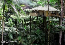
Was just looking around at some jungle huts / cabins on the web. I found some very interesting results which I can take influence from and develop.Also I noticed a lot of my results came from Thailand, so potentially that has led me to do some more research on at a later date, possibly on foliage maybe. For my island theres going to be a few buildings Im hoping to construct. Firstly Ill talk about the buildings Im hoping on constructing in which the resident monkeys of the island will be situated. My initial idea is to have the buildings located at tree level, heres an interesting picture of a similar kind of aesthetic appeal i am hoping for on my game level as shown below.

Really like this image and its a great place to base some of my ideas on. I like the way the hut is kind of hibernated in the trees which is something i am aiming for which my concept as I want the idea of a deep tropical rainforest, similar to the Amazon. I'm not too keen on the idea of square huts though So i am thinking in something more like a Circular round hut. One of the reasons is Im planning on having the cable car station / hut as a square footing and I don't want the island to be to repetitive. Im undecided at this point as to how interactive I want the monkey huts to be. Im thinking maybe just have one where you can enter and look around the interior, but i'm undecided, thats an idea to develop in at a further date. I'm also thinking of connecting the monkey huts through a kind of tree path / bridge but again not such on how much interactivity i am going to include. Im planning on having a few buildings. There all gonna be the same building with maybe a little alterations. as I don't want to leave myself too much to do. Here below is a good image I found which I can base my ideas on for a round hut.

Just an idea of the kind of feel of the idea i am going for with the round hut. Should be easy to construct on Maya and texturing should be straightforward and for the interior, i am planning to have a couple of things to interact with, as to now i am not sure what but a few ideas I though of. Maybe turning on the television for the latest news on the island or even the radio which would properly be a more appropriate and easier option, what with been on a island. I plan on developing these ideas more within my concept art.

As aposed to my idea of having the huts located within three height. within my research I came across this image as shown below of having located within the water and been surrounded by beautiful landscraping around, the image is absolutly beautiful and has really opened up the idea of including water, but more than likely still having the huts at tree height. I think it would also add more apeal to the island, with the idea of including plenty of tropical trees within, I think it would make a nice different to include a lake, of which I could react with to get some lovely reflections of the water. quite like an idea of interacting with the buckets win which they go down and collect the water. I belive the addition of the lake would add so much more apeal to the island, and is a direction im more than likely going to include how im going to use it, im not sure as to this state. On another note I really like the shapes and textures of the buildings, the kind of triangle effect buildings which seems to be very poular and the textures of straw / palm roofs is very popular, and also bright and would greatly apeal to the younger audience.

Thought it would be a great part of research to actually look at a building similar to the kind of feel which im going for which has already been rendered through using maya. The main think I picked upon is that the design of the building is very simple however the right use of the textures really makes it stand out as something very interesting, which is something I should definatly consider, sometimes its more effective to have simple designs but get a beautiful texture which will stand out more compared to the vice versa. Whilst the building is a little to huanoid for me I really like the idea of having overgrown folliage, which is something to take forward and would react well upon the setting and the textures.


Just a few more buildings which grabbed my apeal. Im not sure in my design whether to have a kind of step walkway to reach the first hut, or to just gradually increase the size and have the first hut land level. I do like the idea of having a kind of rope to climb up as it liks withing the criteria of a monkeys behaviour as ther a re good climbers, but could be potentially trick executing when getting into unity but its an idea.
Wednesday, 9 February 2011
Contextual Influences Year 2 - Essay Ideas

Here are some Ideas I thought of for my essay. I though with my interest been with illustation / concept art it was best focusing on this aspect towards my essay. I was reccomended to look into the uncanny valley within games and film. So I just made a quick brainstorm of potential areas to develop into within my essay
Contextual Influences Year 2 - Writing and Being
For this lecture we were introduced to thories of writing, what with us having to ride an essay in the near future is was definatly an apropiate lecture. All forms of writing are a kind of story telling form, whether it be about ourselves or someone else, negative or positive. Most of the time its regarded as verbal communication with friends, family, boss whatever. However we always talk in our minds too asking for self assurance or thinking whether its the right thing to proceed in or asking for advice maybe, which is a weird one to answer as how can we ask ourself for advice, but sometimes I think we regard our mind as another person and ask our inner voice for advice. Our inner voice acts as a narrator and from this we learn how to react do certain situations which other a period of time becomes its on chracter in a way and when we come to a finish ie stop writing, we are able to retuen to ourselfves and have possibly contrasting opinions in some cases to what we have just said, we let our mind come into this character when writing.
Michael Gazzaniga's view is that of an interpreter within us which creates a unique feeling to make onesself unique and this is through the interpreter having separate knowledge on our lives and our inner voice from our previous character become a history to seep into our current understanding and damage to the area of the interpreter can result in narratives created by people who have an unfixed perception of reality.
Michael Gazzaniga's view is that of an interpreter within us which creates a unique feeling to make onesself unique and this is through the interpreter having separate knowledge on our lives and our inner voice from our previous character become a history to seep into our current understanding and damage to the area of the interpreter can result in narratives created by people who have an unfixed perception of reality.
Making Notes In Relation To Text
In this weeks lecture we read 'The Medium Is The Massage' by Marshall McLuhan which is a book from 1947, which takes an in depth sight at the way technology will improve and how it will effect our lives and how we will view things. The book is an example of a really graphic book and very interesting use of imagery as demonstrated below and looks way ahead of its time which relates to the subject matter well.


Heres A few notes I took from the lecture. Im not the biggest fan of note taking, because for me I try writing down stuff and end of not hearing what is been said but I understand it is a good form of remembering key infomation, and I did learn a few things from the lecture and from my notes I can go back and revisit which is useful.


Overall from what I remember the book was a very interesting read indeed and even from its time You can really relate to the book and the changes that have happened which the book as predicted. Just look at how easy it is to keep in communication with someone, and how easy it is to track someone down say on Facebook which was mentioned in my notes, which may be regarded in both a positive and negative factor .Also alot of people tend to see no reason as to go outside ie been stuck inside and you can no alot about certain people without even meeting them such as music taste, hobbies without even speaking to them which could be regarded as knowing to much linking to the book.
contextual Influences Year 2 - Communication Theory
This week we looked into a little of communication theorys and were introduced to these seven types and these are either Transmissional or Constitutive theories and we looked at the Transmissional Theory of Cybernetic or Information Theory of Communication.
Transmissional theory is the technical side of sending and receiving messages and the unknowing of getting the messages wrong.
Constituitive theory is how messages are seen and how the message is similar to the sender as well as the receiver. Receiving a message from someone with a different cultured background which is viewed in a different perpsective.
Cybernetic theory is the steps of the transmission process into detailed steps and there are three sets of problems:
1.Technical is the coding of the transmission in terms of codes and the systems usage.
2.Semantics is the language of the message and how they it would be a problem if part of the message was lost
3.Effectiveness is the message giving the right mood through the messages wording
The Constitutive theory breaks into sub-categories that are part of the traditions
1.Semiotics-language being precise to become a clear message
2.Phenomenological Tradition-the repetitive use of a message through the understanding of physical life experiences
3.Classical Phenomonology-the viewers subjective analysis is not considered
4.Phenomonology of Perception-our knowledge is through our choices from views
Semiotics are a form that is best recieced in the advertisement industry which is used as a form of a clear message with the aim of grabbing the audiences attention by making the message apeal to the target audience by hooking them in and using the form of text and image as a clear message which is interpretated such as good quality, buy this and so on.
WEEK 2
Ill keep this post to one as it carries on from the previous week. In this wwks lecture we looked at a futher four more theories relating to communication, thhese were:
Rhetorical-this theory is one which provides much more of a viewpoint on the communcation process and is a process which isn't a single one but is a circular process in one which when sent a message you will get a reply and even forwarding particular messages to others thus creating a process which carries on.
Socio-Psychological-this theory is the scientific understanding of how the thought, behaviour and feelings of people are influenced by other peoples presence through actual, imagined and implied presence. e.g. From someone thinking of another person doing a terrible act influences you behaviour or thought towards that person.
Socio-Cultural-this theory revolves around how society contributes towards individuals development from teacher to student. e.g. A student developes by being around a teacher someone intellectual to teach the student and the students society developes them with cultural beliefs being and strong point or a negative one.
Critical-this theory is an understanding of being criticised and allowing negative feedback to be a form of positive feedback.
Contextual Influences Year 2 - Start Of A New Phase film noir
This weeks lesson was just considered as a general catch up and trying to get us all to catch up and start blogging and joing in which online conversations about certain areas of contextual studies. However we did talk about pacific genres, and the kind of style they use in relation. However we also had a little look back at some previous lectures that we had been recieving in relation to the brief we had just completed which was the title sequence and looking ahead to the two parellel briefs. We were just looking at and reminded of certain theories which we could relate to a draw influence from for the briefs.
I believe that running these lectures in parallel to the title sequence worked out really well and in generall was greatly received. It gave us a good insight into certain areas of title sequences such as imagery, typography and sound and helped us to understand and influence how to tackle these areas in apropiate to the mood and genre we were trying to set within. I found the Cinema door theory very interesting and helped me greatly with my project, as sound is a major part of the cinema door it helped me create an apropiate atmosphere and also set the story and genre and get the audience gripped, probably more than the use of images in a way. I created A kind of suspense uneasy tone as that relates well to my sequece of a crime / gang graphic novel. I was also given a great insight into the use of typorgraphy and really enjoyed the lecture before of how certain typography may be seen from a negative view because of there past connections.
Heres A few theories I have been looking at depending on the brief.
Title Sequence
- The Cinema Door
- The Emdodied Mind
- Use Of Typography
Game Art Animation
- 7 Basic Story Lines
The Quest
Voyage and Return
Rebirth
Comedy
Tragedy
Overcoming the Monster
- The Uncanny Valley
Music Video
- Discord
- The Embodied Mind
I think all these theory's could influence me on the respected brief
Contextual Influences Year 2 - The Embodied Mind
This week, we were given an introduction to the phrase The Embodied Mind, at first introduction of the title I had no idea what to expect and have never herd the term of the phrase. We discussed how the Embodied mind affects the perception of the world around us, to the point where the mind starts to understand the world through the use of our limbs. What I mean by this is when we use objects consistantly in our lives, this can be anything from a Toothbrush to a Game Controller or remote. We use them so much and understand the functions of this item, to the point in where we consider the object an extra limb, and regard them with more importance in some casses.
With the body thinking that certain objects are an extra limb that is joint to the body this has an effect on the mind as it begins to believe than on a extra limb or expanded from the use of certain objects that are in some form joint to the body because it becomes an easy transition to join the limbs of the body to objects that have been aacustomed to you and which makes the unwanted elements that aren't used become a waste and forgotten.
During this lecture we took a look into a few other thories in which we could relate to a couple of briefs which we were running parallel, these were the Game Level Part 1 and the music video brief and had to think about different theorys in which to head down and connect to the brief. I dont consider myself ever getting into film making, But I found the theoy about "discord" the most interesting and what represent film making well,it looks at how the music extract certain emotions of the viewer through melodies or moods of the sound which can help in the suspense of a thriller or build up an ending of scene. At this time I had no idea in what Kind of route I was going to take with my project, but I gained knowledge on types of sound you would use for example building up a suspense in a horror film in which Synthesizers are almost always used in horror films because they can produce otherworldly sounds, and are used alot in SCI FI films, however I also found the extract in which Alfred Hitchcock wanted no music for the 1944 film Lifeboat, because the characters are ''out on the open ocean. Interesting and asks me the wuestion do you even need music / sound effects to create a good atmosphere. I foun this topic really interesting and gives me an insight on how to create a good atmosphere in my music video and relate sound to imagery well.
The other brief we are doing at the moment is the game art brief in which we are designing and animating a character there are many theories that are available and found some stuck out more than others such as the seven basic storylines which is basically that all stories throughout history have involved some sort of connection to the seven stories that have been used constantly throughout history even though they seem different the sic structure of the story is simple and similar. This theory could give me an insight on how to animate a character and relate it well to the stoyline. Other theories around are that for example of the uncanny valley, of which we will accept the character more if it was less human like which is a really interesting factor. Like the Music theory this has given my research and influence into developing my project.
Another question we were asked was why Do people dislike comic sans ? and is it because they find it too babyish?
To be honest Im not sure how to answer this, as it just matter of opinion but I think it could have an effect on the brain and how different people see things, as the general opinion I believe is creative people such as myself who try and come up with new designs and concepts forsee it as an overused type face in the same lines with times roman and Ariel, we just see it all the time, therefor if we used it I believe it would'nt represent our creativity in trying something new. Hoever less creative people probably like it because they see it every day in popular and mainstream places they automatically persume in that its a great text to use because of how much it surrounds us in our lifes. I believe some people just find it babyish because like mentioned before its used everywhere and shows no innitiative similar to the charisma of a baby / child.
Contextual Influences Year 2 - Analysing Title Sequence
I decided to analysis the title sequence for the film "Catch Me If You Can" I decided to analysis this opening sequence as the style was something similar to what I was aiming for within my project, that kind of sillohette approach which deeply impresses me and that kind of saul bass influenced feel.
This one of my favorite title sequences, its just beautifully designed from the start to the finish, the title sequence follows the brief outline of the story and its a really apropiate use of media to useas it has that kind of 60's feel for it both in use of typography and the use of sound which connects will revealing to the audeience the time in which the film is set. Theres also some great use of kinectic typography used for example the the way the typography in animated to connect with the words foe example the way in which the word "Catch" is animated to symbolise, you cant catch me, this is an effect I really like. I really like beautiful tones of colour used often keeping them selves to three colour's which works out really effective due to the use of the silhouettes adding to the great effect created within the sequence.
I especially like the scene in which the character goes up the elevator, this effect is so simple but yet it looks graphically stunning, something Im hoping to achieve on my title sequence.The way in which the typography interacts with the screen for example is something I really aspire to and the way it feels like you interact with the next scene, to me this symbolises The the effect of the main character trying to escape, and the chase continuing, not giving to anytime to slow down. I really admire the use of imagery, such as planes and lifts, Its very appropriate to the film and and the way they are animated is beautiful, nothing to complex at all, just simple animations of them moving up and down, but the way it is sone and how it interacts with especially the typography gives the impression well of something more complex, for example like I mentioned the moment in where the lift moves up is just a square. On a similar point the way in which objects such as elevators and Aeroplanes are simplified to basic shapes is really well done and suits in with the rest of the sequence well
Theres nothing at all I could comment on in regards to things I dislike, everything seems perfect to me and is defiantly my favourite title sequence using this certain style, other sequences using a similar style or Madmen, Hustle and more notably the icon Anatomy Of Murder sequence, but this defiantly more than holds it own, everything from imagery, typography and animation is flawless and something I would like to take influence from in regards to my sequence.
Taking this into my project after analysing the sequence there is plenty of stuff Im hoping on taking into my project, what with me doing a graphic novel "100 Bullets" this is a perfect chance do try attempt a similar form of media to that which is used on The Catch Me If You Can title sequence and would defiantly be an appropriate use of media what with 100 Bullets been based on a graphic novel. So defiantly analysing this film title and breaking it down in to what I like about it has given my plenty of influence and ideas in which to develop into my own title sequence.
Contextual Influences Year 2 - Cinema as Door
For this weeks lesson we were introduced to the term "Cinema is a Doorway." The idea of this figure of speech is the way in which a film will introduce itself to the viewers and the way it will lure them in, to do this it will have something that opens up with capturing the audience's imagination, this can be obtained through a variety of methods such as setting a tone or emotion.
We then looked into how the opening of a film should remind the viewer of where the film is from such as the time its set and what its trying to message to the audience, which helps with the transition into the film world.
Other things that can help its cause is the use of sounds such as diegetic and non diegetic sounds, these are sounds the viewers can instantly relate too, also a diegetic voice can tell a stpry such as the roll of narration, for instant can be use as flashbacks or even when seeing into the future, this form is great as it can tell a little back story of the character and inform the audience whether its positive or negative impact.
Heres a few terms and there meanings I learned within the lesson too
- Paratex: Text within text, altering the meaning of one text.
- Paragon: Moving between worlds.
Also in todays lesson we were looking at the relationship between text and film and the different forms you can use emotion within. This is named Kinetic Typography which is a great way of linking text and film, however it is used by not including any footage, just the use of typography for example if its a angry tone of voice the use of typography will be big,bold and right in your face whereas on the other hand if its a quiet tone the typography will be small and timid. Its a great technique to use and one which I can gain influence within for my title sequence. Im thinking of having the typography react with the music / sound effects such as having bullet shots and having the typography splatter around a bit, and even car sounds and maybe have text apear fast and go along the screen to give effect of a kind of car chase without including any imagery which is a great idea to proceed in. Heres a few examples of kinetic typograthy in action.
Its a great use of typography and would love to experiment with this form for my title sequence, and set a good theme which will lure the audience in relating it to the term "Cinema as a Doorway"
Contextual influences Year 2 - Film Review

Welcome to the year of animation, 2010 has been a great year for 3D animated films, what with the sucsess of Despicable Me, and the well received How To Train A Dragon. And now is the turn of Megamind, A 3D animated film prodiced by dreamworks, the ever famous company responsible for big hitters such as Shrek and A Sharks Tale and boy does it rank up there with some of Dreamworks finest work.
The basic plot is about a super itelligant alien voiced by the ever poular Will Ferrel who attempts to conquer the city with his sidekick Minion voiced by David Cross. Ever since an early age however there has been a spanner in the works, who has defeated him on every attempt to take over the city, Voiced by the hugely incited Brad Pitt Metro Man has defeated him with ease on every attempt. However Megamind has one more attempt of pure evil in conquering the city left him in and to his surprise he succeeds and led to believe he has finished of the rivalry with Metro Man for good. However in conquering the city he then finds that Roxanne Ritchie, voiced by Tina Frey begins to conquer his heart, after his attempts of trying to win her over through disguising himself as Bernard, he is then found out and Megamind is left heartbroken. From that moment he begins to question himself. To the point where he begins to miss Metro Man and there long feud. So in the hope of trying to rediscover a rivalry he invents some superhero injection, to which he accidentally injects Roxanne's cameraman, voiced by Jonah Hill. However becomes too powerful for even Megamind and begins to cause havoc on the city to which Roxanne and Megamind team up with the hope of saving the city, However thats not his only goal. Theres plenty of thrills and surprises left in the story however I wouldn't want to ruin them for you.
Overall I really enjoyed The film, it has a bright and colourful feeling to the animation, with huge elements of humour mainly provided by Minion and the brilliant casting Of David Cross with his highly recognisable voice but all the characters provide moments of brilliance within the film. The storyline does feel a little cliched and feels like old recycled material from over films around, however this makes up for it with the highly light hearted appeal and not taken itself too serious. I really enjoy the goofiness of the film and just adds an extra element to the film what with the unique inventions such an a "Illiteracy beam" and something called "Typhoon Cheese" just adding to the whack concept of the film.
Overall its a thoroughly enjoyable film with beautiful animation and huge amounts of comic value, however The story feels too cliched and cheesy at times at doesn't set itself outside. Id defiantly recommend Despicable Me over this however its defiantly worth a watch in the age of animation.
7/10
Contextual Influences Year 2 - Brief Intro
A brief outline of myself, I studied pre Leeds College of arts at Chesterfield College where I took up interactive media, however more focused on the graphic side which I did enjoy, but wanted something a little more computer based, which is why im now at Leeds College of arts studying film game and animation.
The area of the course which apeals to me most is concept art, anything from coming up with character designs to game environment levels, I also have an interest in moving text, such as film title sequence and effect based projects such as After Effects. Ive also recentky become very keen on the unity software having really eyed the recent project. At this time though I feel concept art and Games designer is the best route for me.
I have to be honest the theory side of things is an area which deeply confuses me and a topic I struggle to get the grasps on, It took me a very long time to even begin to understand the term uncanny and its purpose, however I belife my knowledge on the subject has deeply improved within time. I'd have to say Id like to know about theories towards my specialism area which happenes to be as mentioned before concept art and games designer. Im not sure on pacific topics within this area but I'm quite interested by the theory of photorealism which is potentially an area I'd like to learn alot more about, but any related theory on that subject would greatly interest me.
The book I have chosen to respond to is 100 Bullets, It was really hard in choosing on a book but for the type of media I wanted to design my title sequence in, which was very graphic, syloette aproach and hand drawn text,that kind of saul bass aproach. which Is why I though 100 bullets would be great to use as withit been a graphic novel and would connect within its apropiate genre. What I want from this module is to improve my knowledge within the area of typography and image and to gain a greater understanding which I can put forward to my final piece, for example use of colour, size and font and whether its suitable to use.
Tuesday, 8 February 2011
Game Art Design Part 2 - Statues
For my concept art I cameup with the idea of featuring some statues on the island,was playing Little Big Plant and the idea of including famous statues around the world and converting them into monkeys really apeal to me, and believe would apeal to the age catergory,and could potentially be classed as educational, the idea of a monkey statue of libery, whilst technically its alreadt been done sounds really promising to me.


One of my first ideas which came was to have a A statue situated on the kind of port area of the island. Taking huge influence from the statue of liberty, which is an iconic site and worldwide known. My idea was to have a similar replica however I wanted to add a appeal to my younger audience and creating a humourous appeal, so my idea at this moment is to have a statue of monkey holding a banana based on the shre of the island as the first thing u see upon entering the island which would be really humerous and a great way to set the tone for the island, also someone mentioned humming the national anthem in monkey sounds which I thought was a cracking idea to process with.

I was also given advice to look at the remake of the film Planet of the apes which has a scene at the end of which I am unfamiliar with but will probably check it out at sometime, in which features historical statues such as the Abraham stature featured above however with ape / monkey recreations. Unfortunately I couldn't find any images / videos of the statue of liberty in the remake however plan to check this out at further date.


Another idea I came up with during the concept art was as my terrain idea was to have a kind of well landscaped area with a mountainous region. and I just thought about the cristo Redentor in Brazil and using that as an major influence to a unique statue design. Maybe including instead the ruler of the island, probably my robot character to suggest to the audience his importance and the monkeys bow down before him, only issue I have is I dont want him to be treated as a God, I want him to be treated as a enemy of which the monkeys are trying to dethrone. I believe this could work really well. Maybe even potentiall include a cable car which animates and goes up the hill to which the robot is located in secret possibly even under the statue maybe. iI really do like this idea and would be easy as to model, what with my robot character already been modelled.


Just thanking about some statues, I though about the iconic statues which surround Easter Island. I though this would be a great part to do some research on as their located on island in the pacific, which is kind of the similar location i am aiming for with my island and the potential idea of including monkey head statues on the shore similar to that of easter island would be a great idea but have them more apealing to the younger audience, maybe each one pulling a different expression. I really like the idea but with me been useless at modeling faces, could be too time consuming for one element but its a good idea to mention.


Heres just a few monkey statues I found which really appealed to me and which I believe I can draw reference from, maybe have them dotted around the island, maybe even have to collect some across the island hidden in secret locations, similar to variety of games, or your even rewarded one for saving the island. Just a few dsigns to gain influence from.
Monday, 7 February 2011
Contextual Influences Year 2 - History Of Type
In todays lesson we started of our leval 5 Studious looking into typography and looking at some of the history surrounding this interesting subject. Typography has been a round at a long including the ancient eygptian times. How ever looking into fonts Johannes Guthenberg introduced the world to the idea of print making and the first insight to moveable type
. His concept involved carving wooden blocks into indiviual letters then pressing them onto the pages. This concept was mostly used in bibles as it was a very expensive venture and often people atempted to steal as the bible was thought to be worth a fortune for its time as it was considered a major breakthrough. Heres an example the font used in a book.

Below is a font called Old English, which surprisingly originated in Germany, and is conisdered a gothic typeface and is often associated with a negative presence. Is probably most famous for its involvement with Adolf Hitler, who wanted to use the font to represent Germany, thus from those days the font has always been proceeded in a negative wiew. And is also familiar with hells angels and has become a popular tatoo font and is often seen as anyone who is anti - social or wants to casue contriversy.

Following on from the typeface Old English.The next mafoj advancment in the history of typography was the Humanist Handwriting style which came from the 15 century and was invented by nicolas Jenson. This style of font is now known as Venetia Style and introduced the world to itallics which gave a feel of handwritten font.
The first moveable text arguably was that of what was included in the film trailor for the Movie Metropolis, which is a greap peice of moveable text by todays standate and its inevitable alot of title have tooken major influence from this squence, from the likes of Saul Bass to even title sequences of huge modern films such as Catch Me As You Can such was the brilliance and one in which I can take infulence from looking into my film title sequence as im going for that saul bass look which I can draw reference from the Metropolis sequence shown below
Subscribe to:
Comments (Atom)