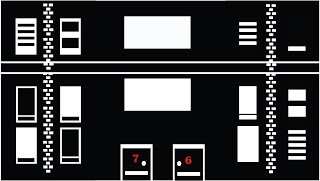
Firstly the results were really good and I was happy with the way the texture came out. It looked very graphic novel influenced, which im happy about as thats the style im going for, that sin City feel. However There was something I wasnt too keen with and that was not the building or texture. I was starting to have second thoughts on the Skyline colours which at this time were red and black, mainly due to the fact that like sin city the black and white are the main contrasting colours which are used, And my plans are to emphasise certain aspects of the environment such as Blood, Guns and so on with the colour red, However with the skyline been red whilst it looks good and very sunset like, I feel I may loose that effect. also with the way I have designed, Id have to keep the water and land potentially red or else it could look very messy, however it might not, but overall I think its the right choice to make. Its not a hard job to fix, its just going on illustator and chanding the colours, my idea now was to have the sky white and the buildings black with the windows white, that effect Ive mentioned earlier, However what I belief will look good now is to have the sun red to contrast well and stand out. Heres my results below.

I actually prefer this look, and when put onto unity it looks really effective and works well, however I beliefe Im in a change of direction as the syline dosent work as well with the black textures on the buildings as I would have Liked so I'm going to look into experimenting with the colour white for the buildings.


No comments:
Post a Comment